
Before we begin dissecting color and looking at images and graphics, you must first understand a general concept about color spaces. The International Commission on Illumination (abbreviated CIE for its French name, Commission internationale de l'éclairage) developed a chromacity diagram in 1931 which illustrates all the visible color available with wavelengths in nanometers.
We need to embrace a few facts about how we’re viewing this topic because there are some inherent limitations due to available technology.
All visible colors which can be seen by the average human eye.

RGB Monitor

High color-accuracy monitors

Standard printing techniques (CMYK process)

In-ten-si-ty \ in-‘ten-sət-ē
Intensity is the quantity of light on an area. It is an objective quality that is measured in footcandles. Brightness \ ‘brit-nes
Brightness is a subjective value of how intense a light appears to us. Our ability to perceive color is contingent upon three variables:
Intensity is the quantity of light on an area. It is an objective quality that is measured in footcandles. Brightness \ ‘brit-nes
Brightness is a subjective value of how intense a light appears to us. Our ability to perceive color is contingent upon three variables:
- a) The color and reflectiveness of the object we're viewing.
- b) The eye and the brain of the viewer (including physical and psychological considerations).
- c) The quality of the light source.
While the lighting designer must understand how the lighting will affect and be affected by what's on stage, in the end it is up to both the eye and the mind of the individual audience member to interpret the color they see.
| 8% of males and 0.4% of females have some type of abnormal color vision. *source: http://www.colourblindawareness.org/ |
Our perception of intensity does not match, on a one-to-one basis, the measurement of intensity in footcandles. If the measurement of one light source is twice as intense as the measurement of another, it will not necessarily look twice as bright to our eyes.
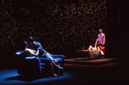
Production photo from “Touch” Lighting & scenery designed by Kade Mendelowitz
Our eyes can adapt to a wide range of intensity. They can adjust from intensities as small as a fraction of a foot candle, as in a darkened theater, up to intensities of tens of thousands of footcandles, as in a sunny day in the desert.
Our eyes are more sensitive to changes in intensity at lower levels of intensity.
The difference between 4 and 5 footcandles is more apparent to us than the difference between 400 and 500 footcandles.
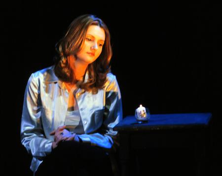
Model photo by Kade Mendelowitz
Our perception of brightness is relative. An actor lit with 10 footcandles of light against a black background will look brighter than an actor lit with 100 footcandles against a very bright background.
Color can be defined in several ways.
Hue, Saturation, and Color TemperatureHue – the location of color on the spectrum.
(for example: 475 = Blue, 425 = Violet)
Hue dictates a color's specific “blue-ness”, etc.
Visible Light is just a portion of the electromagnetic spectrum.


A color wheel is an abstract illustrative organization of color hues around a circle. Although, in reality, visible colors do not come around and touch end-to-end, we are able to mix purples by combining blue and red. Color wheels are useful tools for showing relationships between colors.
| Saturation – purity of color. (for example: is the color diluted / thinned?) As if water were added to paint from a tube. |  |

Shade

Tone

Tint